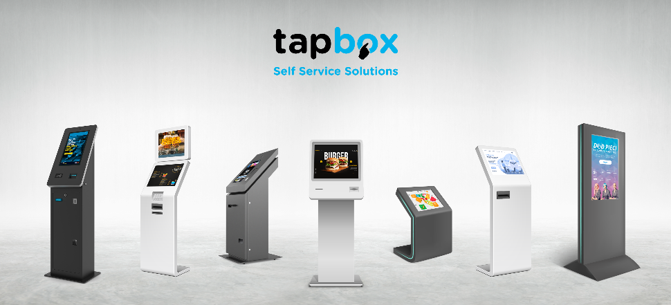
Each self service project is unique – it can be affected by environment around the kiosk, also the product or service one is trying to sell, the client expectations matters but here are the most important user experience designing tips and tricks we have learned from analysing our and other projects:
- Make it dead simple. Because I said so and simplicity sells 🙂 Don’t add features unless they’re genuinely needed. Revise and make it more simple.
- Bigger is better 🙂 Make buttons large, forms large, everything large. You do not want to annoy clients in public when they cannot press the button or field. Consider increasing the clickable areas also around the objects for a few pixels as well.
- Minimise hand movement. Make sure that users do not need to touch the top/bottom/left/right of the screen after each step. Minimal hand movement is key to success when we speak about screens larger than 20’’ (remember that this is very different from mobile UX where almost any user can reach any corner of the screen with a thumb).
- Consider the average height of the user (Pro tip – kids tend to be shorter than adults for example and cannot reach the products on top) and do not forget about accessibility features. This should be considered at the beginning.
- Avoid typing. Typing on a kiosk is annoying. Autocomplete or suggestions could be a solution to make it more comfortable if unavoidable
- There is no hover. Objects that are clickable should look clickable because there is no pointer or hover effect. Also non-clickable objects should not look like one 🙂
- Consider the environment. Light places can be fixed with a higher brightness screen but it should come together with more contrast as well. While sound can be of great assistance to users but it can annoy some users or be missed in loud places.
- No search. If you think you need a search most probably the UX is bad. Users usually give up than use search because of reason #5.
- Auto log-out. Users do not close their sessions at kiosks but simply go away. To avoid the next user a bad experience, integrate auto log-off or sensor that detects when to start a new session.
To discuss the various UX options for your digital kiosk, please get in touch with us today, and one of our friendly experts will be more than happy to advise you!

